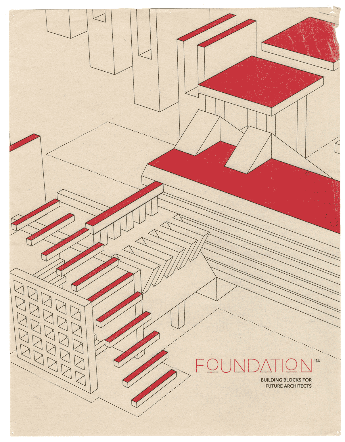
Branding Design Project
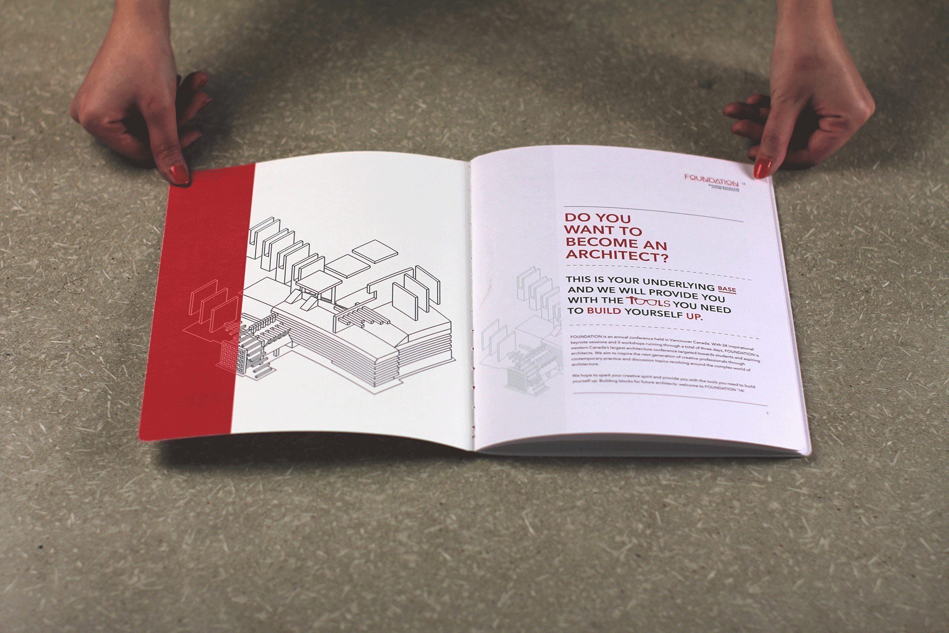
FOUNDATION is an annual conference held in Vancouver Canada targeted towards students and aspiring architects. This branding identity and conference was designed with a pragmatic aesthetic and was inspired by artworks from Walter Gropius of Bauhaus.
View project on Behance
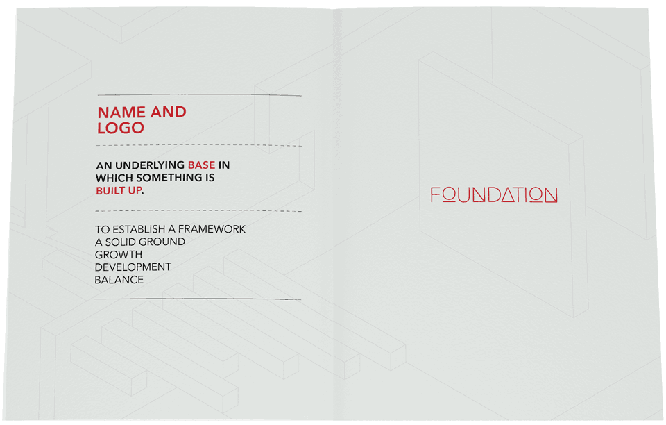
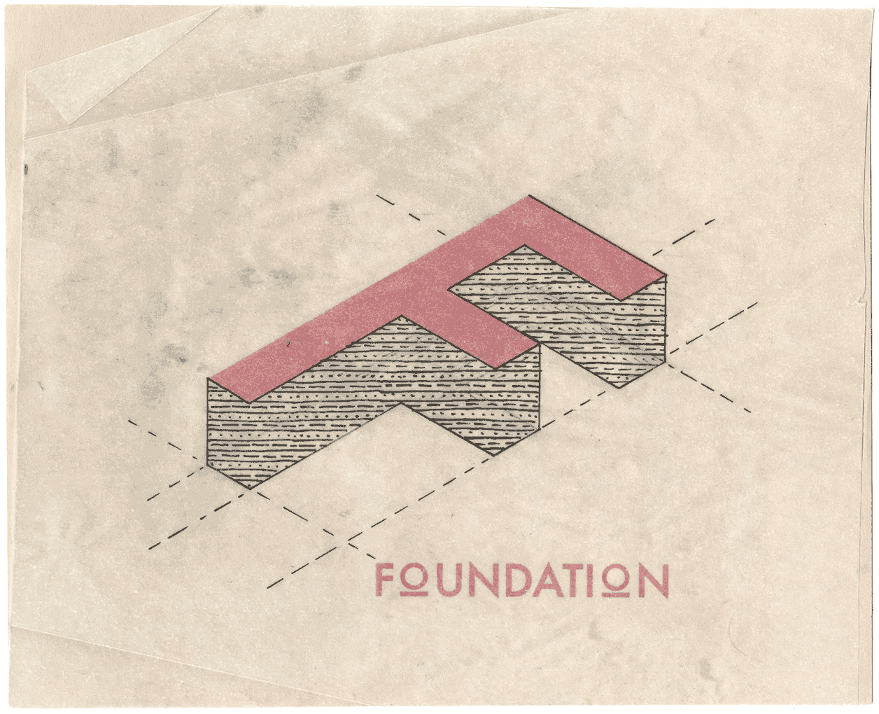
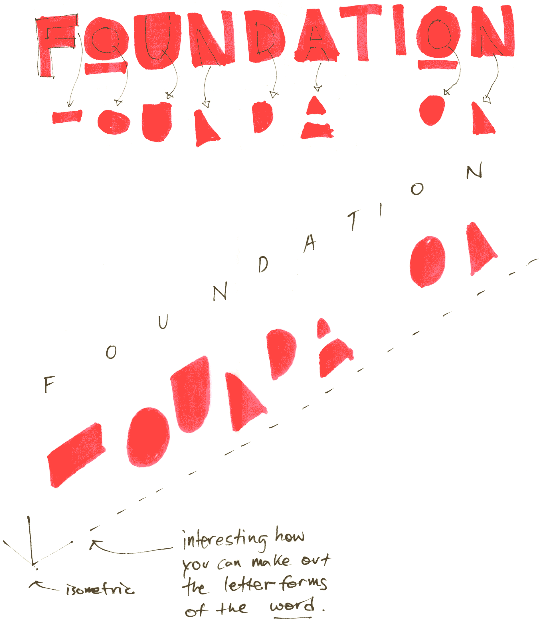
This project's name is derived from the solid ground in which structures are built on top of; a foundation is the underlying base in which something is built up.
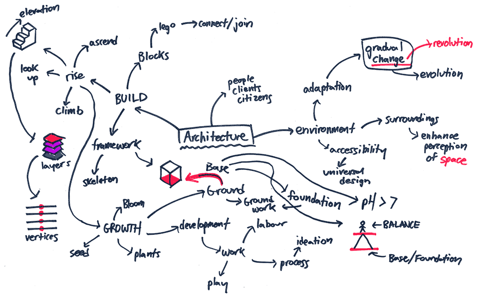
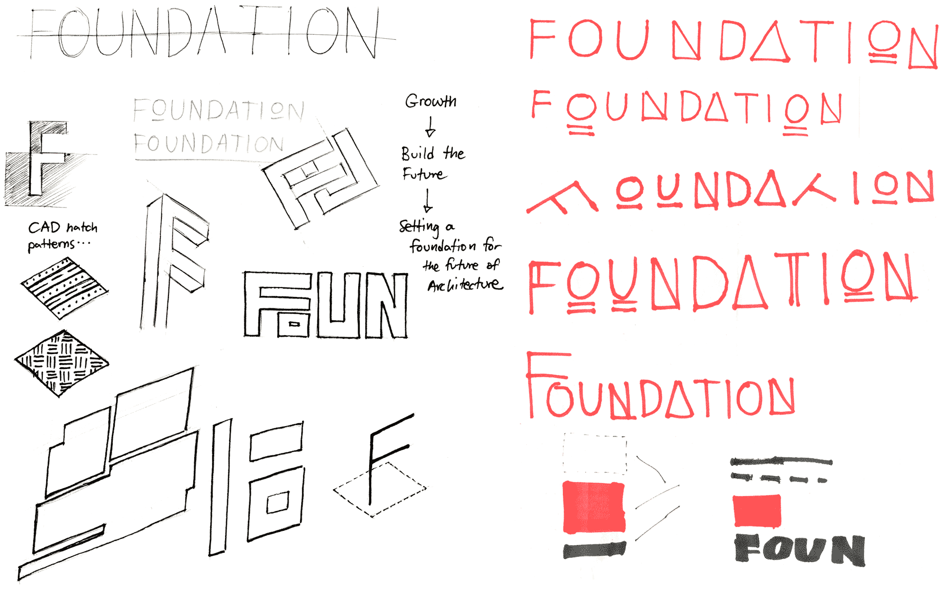
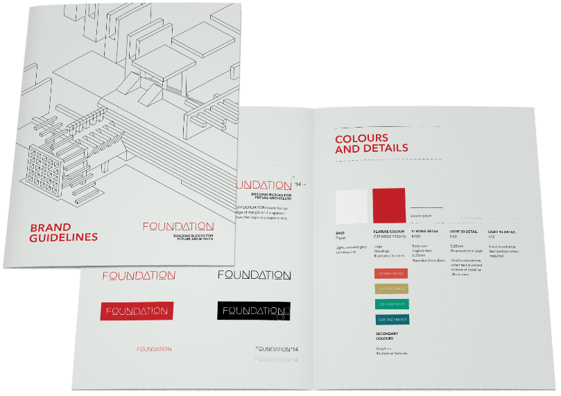
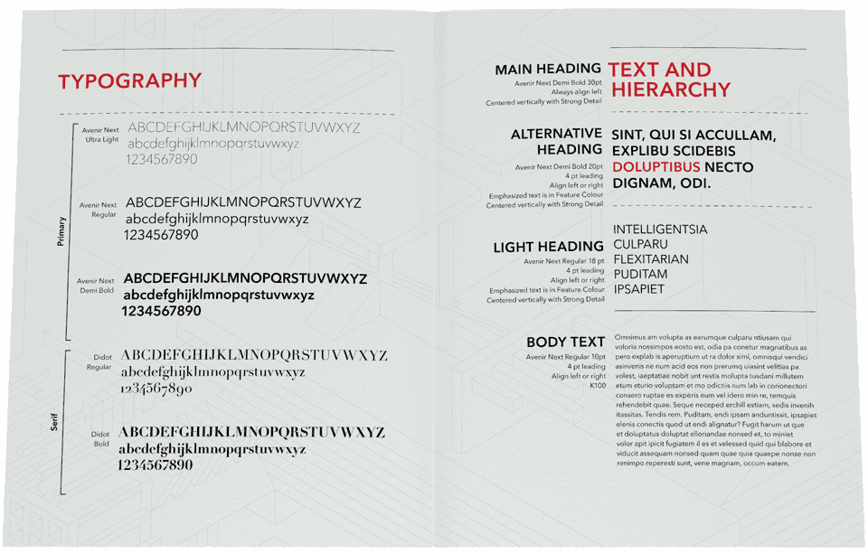
Through experimentation, a visual feel for FOUNDATION was set and then developed further with a style guide. Typography, colour, and illustrations would carry over to set a common visual language which would connect the FOUNDATION brand in various forms of print and digital media.
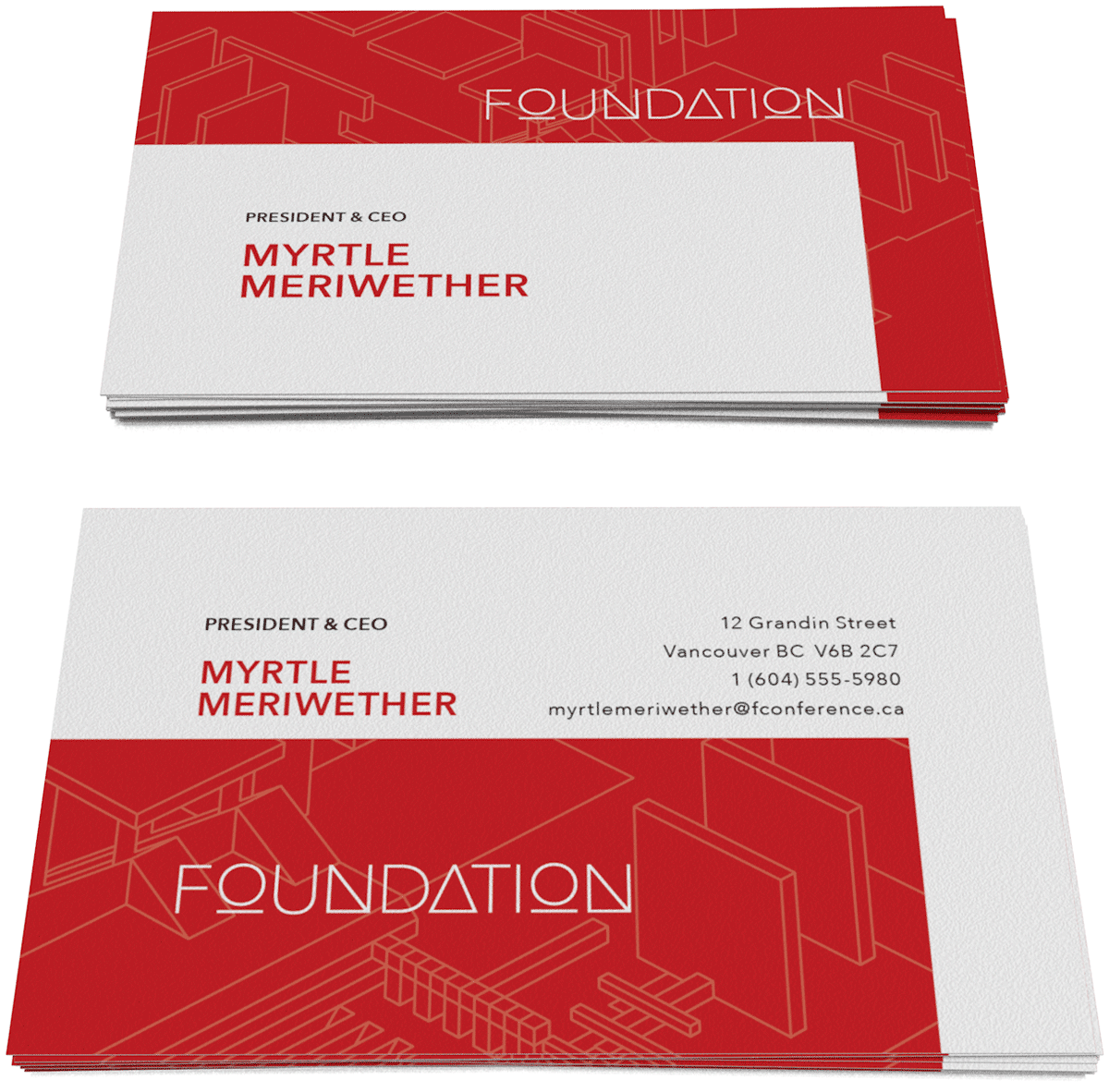
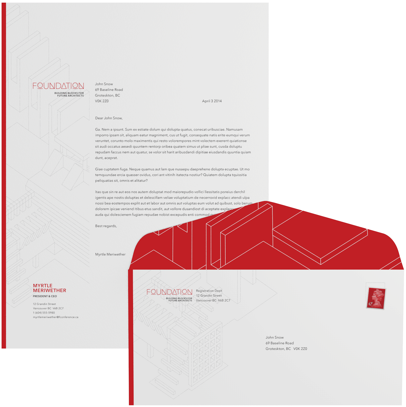
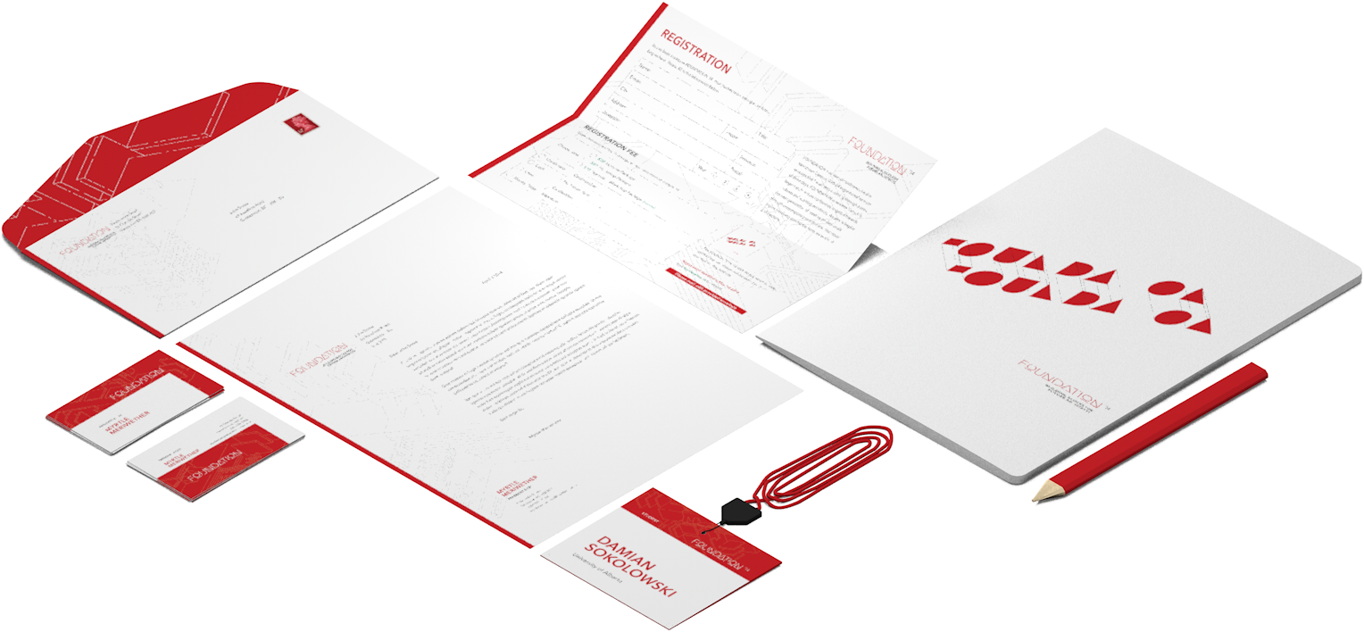
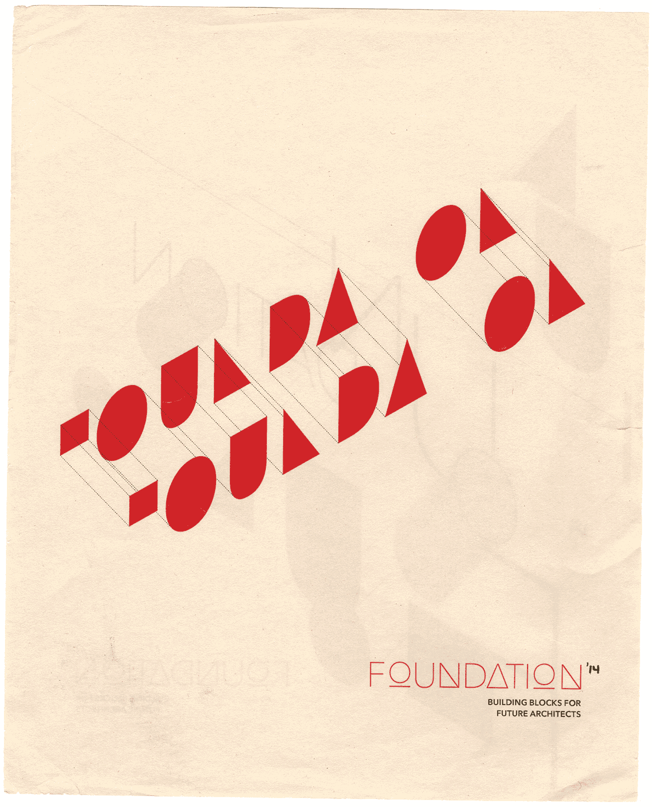
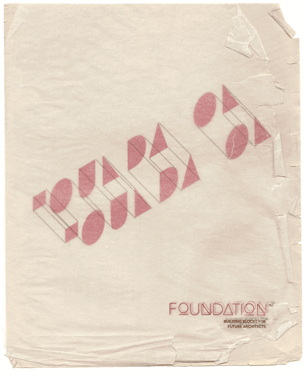
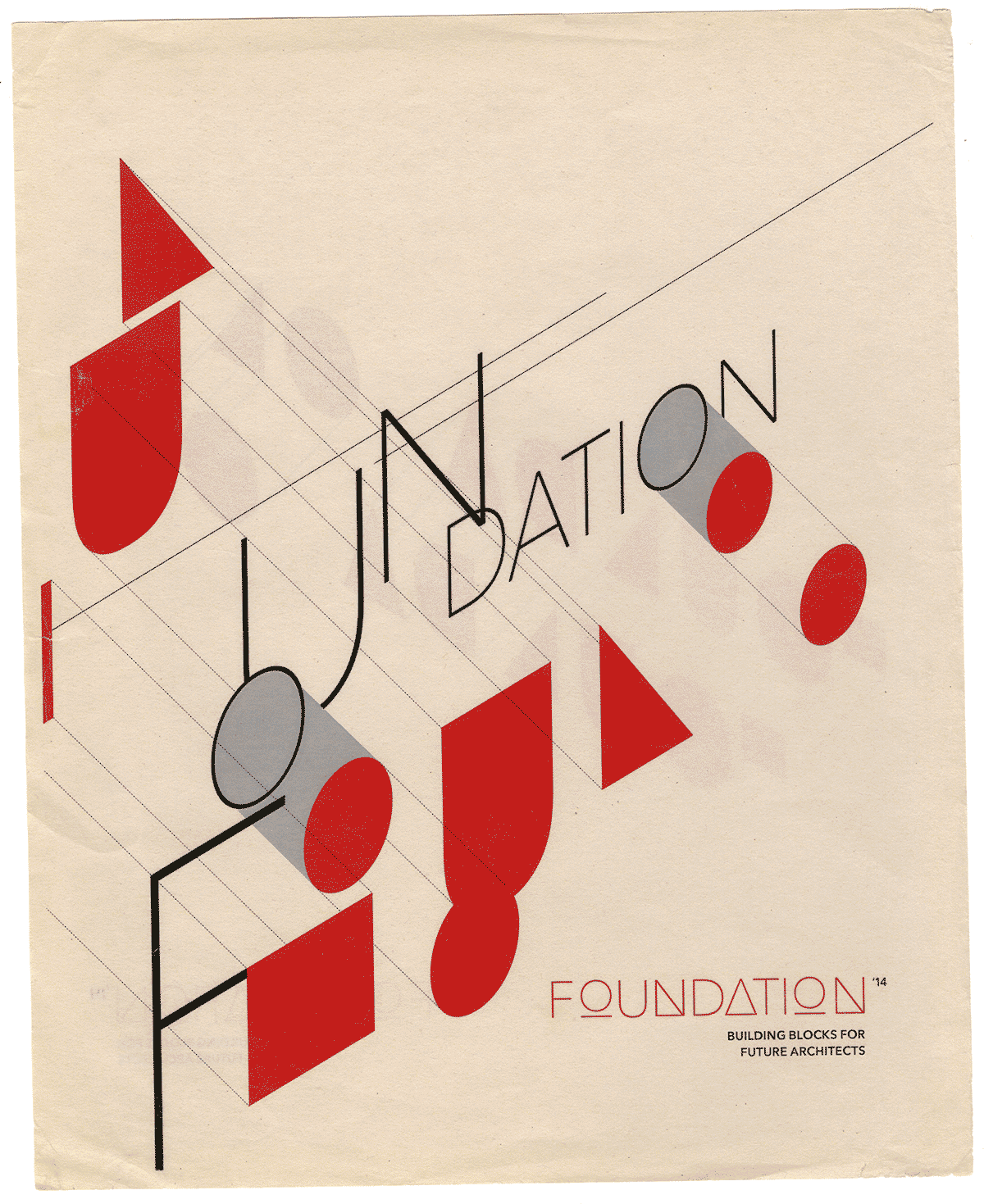
Various forms of print express FOUNDATION's visual language. A bold red with subtle grey lines compliments the grain of white bristol vellum.
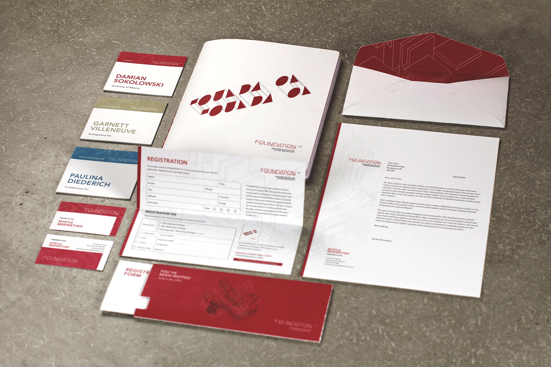

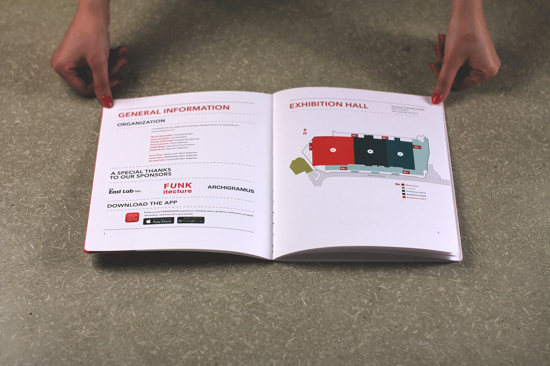
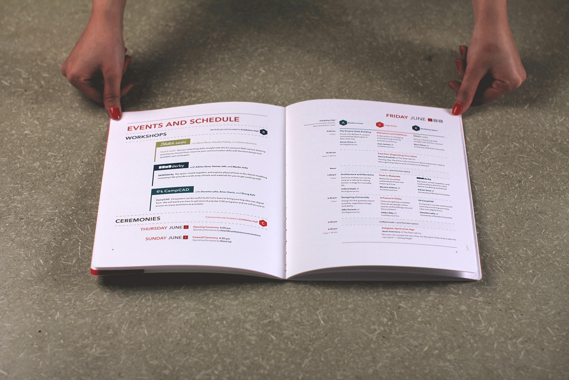
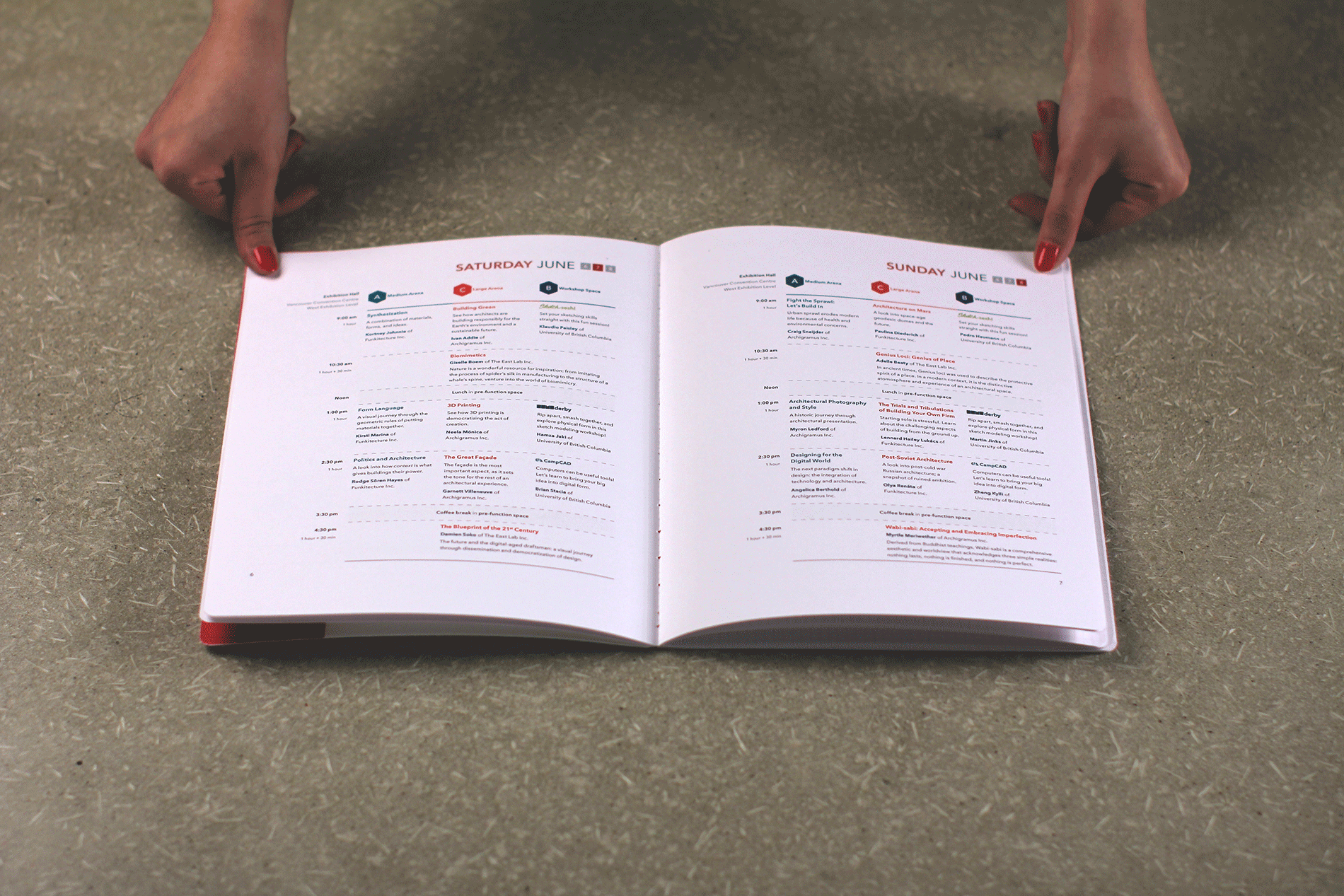
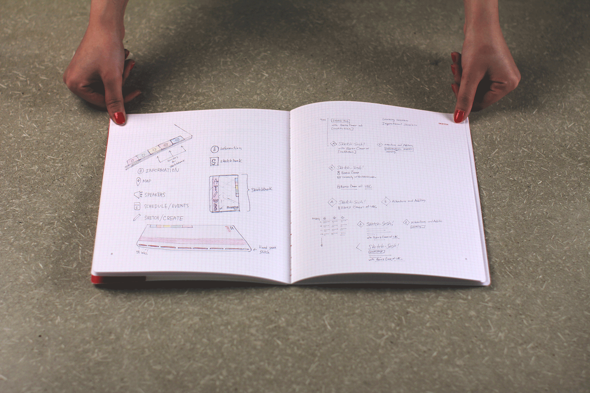
In any creative field, a sketchbook is a must to place your ideas down, especially if you're an architect. Every attendee in FOUNDATION receives a sketchbook which contains conference information, event schedule, an exhibition hall map, and extra pages of grid paper to jot down your ideas. A red carpenters pencil is also included in this package.
The binding of the sketchbook is center sewn with red book-binding thread which matches the FOUNDATION visual identity.
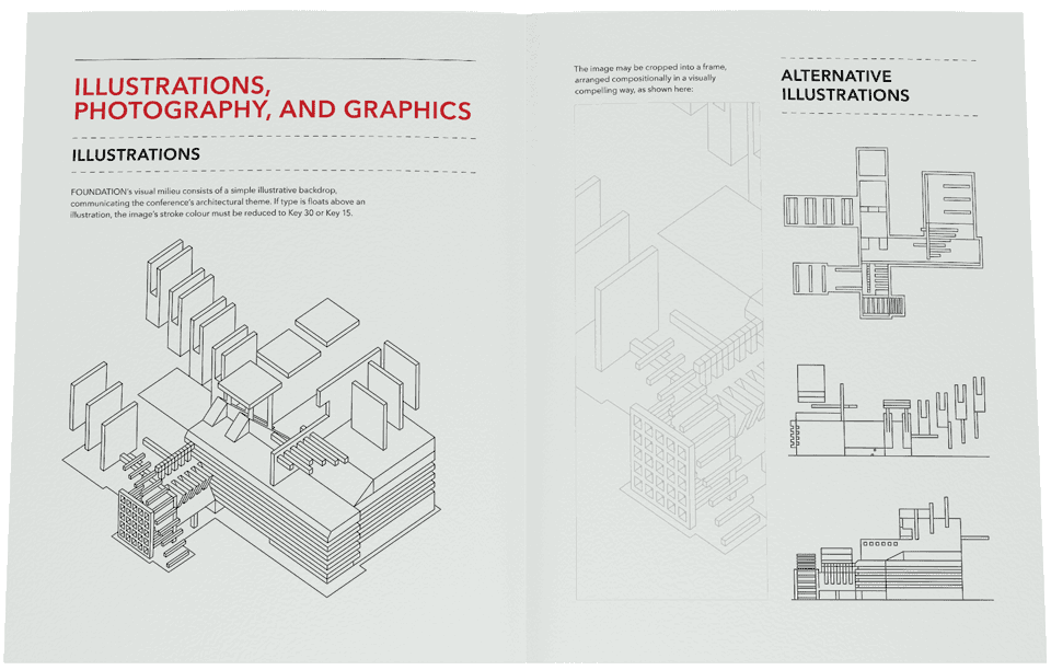
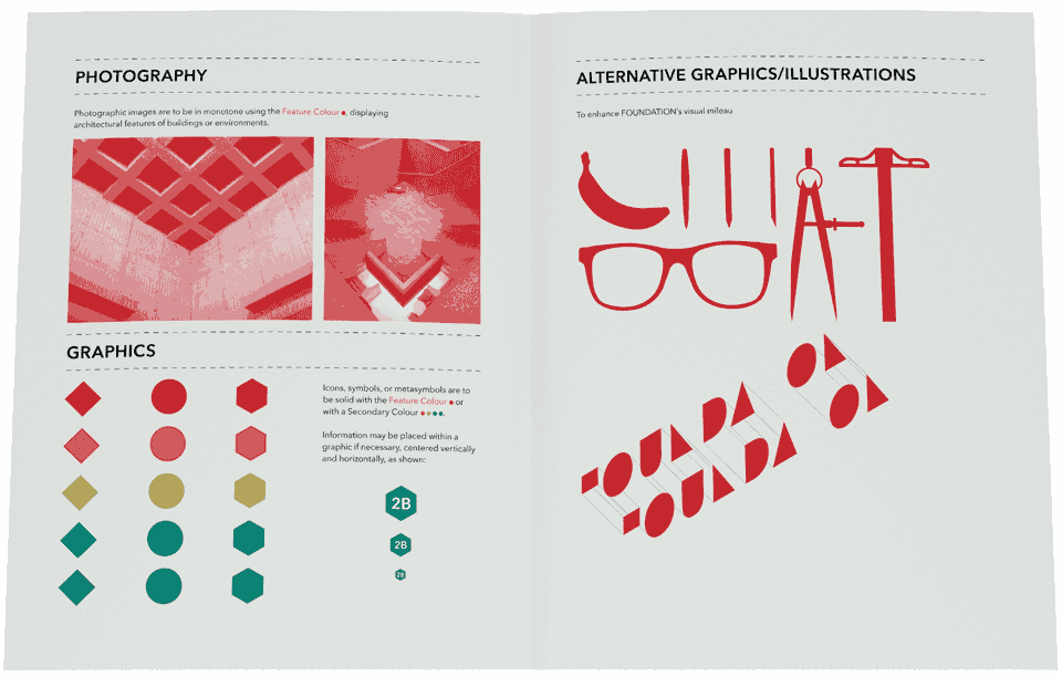
FOUNDATION's visual identity is further communicated with items for corporate use. The bold red and grey isometric illustration is used throughout the FOUNDATION brand.
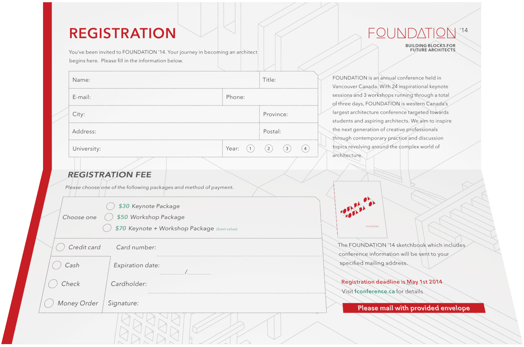
A Registration Form is also sent out to students across post-secondary institutions around the country.